Welcome to Vbond
Color Psychology in Architecture: Choosing the Right ACP Hue for Your Brand

In the world of corporate architecture, a building's exterior is far more than a structural shell—it is a powerful, permanent communication tool. The strategic selection of facade colors, particularly when executed with Aluminum Composite Panel (ACP) cladding, can profoundly influence perception, emotion, and brand recall. This article explores the principles of color psychology in architecture and provides a professional framework for selecting the optimal ACP color finish to authentically and powerfully express your corporate identity.
The Architectural Impact of Color Psychology
Color psychology examines how hues affect human behavior and decision-making. In architecture, these effects are amplified. A facade's color shapes the first impression for clients, investors, and employees, subconsciously communicating brand values before a single word is exchanged. Architectural branding through color is not mere decoration; it is a deliberate strategy to align the physical environment with corporate ethos.
Decoding Hues: A Professional Guide to ACP Color Selection
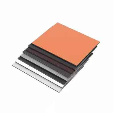
Modern ACP manufacturing offers an extensive palette, from standard RAL colors to custom metallic, matte, and prismatic finishes. Choosing the right hue requires aligning color psychology with brand attributes.
1. Blue ACP: Trust, Stability, & Innovation
Psychology: Evokes feelings of trust, security, calm, and professionalism. Darker navies convey authority, while brighter tech blues suggest innovation and logic.
Ideal For: Financial institutions, tech headquarters, healthcare facilities, and corporate campuses seeking to project reliability and forward-thinking stability.
ACP Application: Consider a satin-finish metallic blue ACP for a sophisticated, tech-oriented look, or a deep matte navy for timeless corporate gravitas.
2. Green ACP: Growth, Sustainability, & Harmony
Psychology: Associated with nature, growth, health, renewal, and financial prosperity. It has a calming, balancing effect.
Ideal For: Environmental organizations, wellness centers, financial firms (associating with "green"), and any brand with a core sustainability branding message.
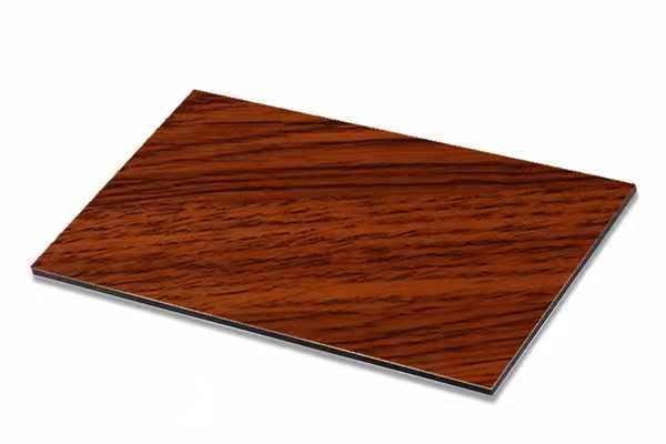
ACP Application: Wood-effect green tones or muted sage on ACP can create a biophilic connection. Vibrant emerald can make a bold statement of vitality and luxury.
3. Red & Orange ACP: Energy, Passion, & Visibility
Psychology: Red commands attention, signaling energy, passion, urgency, and confidence. Orange is seen as friendly, creative, and optimistic.
Ideal For: Entertainment venues, dynamic consumer brands, fast-paced tech companies, and restaurant chains aiming to stimulate appetite and excitement.
ACP Application: Use as an accent color on ACP facades for highlights or entrances. A full facade in red requires careful consideration but guarantees landmark status.
4. Neutral ACP (White, Gray, Black): Sophistication, Minimalism, & Flexibility
Psychology: White implies purity, simplicity, and efficiency. Gray communicates balance, sophistication, and neutrality. Black conveys power, luxury, and elegance.
Ideal For: Luxury brands, minimalist design firms, high-end retail, and corporate entities seeking a timeless, adaptable, and authoritative image.
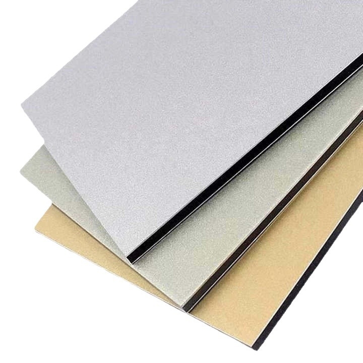
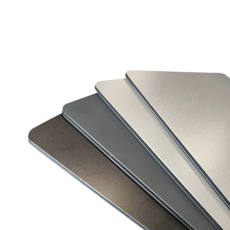
ACP Application: Metallic silver or anthracite gray ACP offers a sleek, modern aesthetic. Pure white matte ACP provides a crisp, clean canvas. Deep black ACP creates a dramatic, powerful silhouette.
5. Yellow ACP: Optimism, Creativity, & Clarity
Psychology: Stimulates mental activity, evokes optimism, warmth, and creativity. It is the most visible color in the spectrum.
Ideal For: Creative agencies, educational institutions, innovative startups, and brands that want to appear accessible and imaginative.
ACP Application: Best used strategically. A sunshine yellow ACP accent wall can create a memorable, welcoming entrance without overwhelming.
Strategic Considerations for Specifying Brand-Aligned ACP
1. Analyze Brand Core Values: Begin with your brand's mission, vision, and personality traits. Is your brand "dependable" (blues), "innovative" (silvers/teals), or "disruptive" (bold accents)?
2. Contextual Harmony vs. Standout Contrast: Decide if the building should harmonize with its environment (using earthy tones) or stand apart as an iconic landmark (using bold, signature colors).
3. Finish is as Important as Hue: The ACP finish—whether high-gloss, matte, metallic, or textured—dramatically alters perception. A matte finish feels contemporary and solid; a metallic finish feels advanced and dynamic.
4. Long-Term Fidelity: Ensure color consistency across all ACP batches and specify high-quality PVDF-coated ACP for superior UV resistance and color retention, protecting your brand's visual equity for decades.
5. Integrated Design Language: Coordinate the facade color with interior design, signage, and landscaping to create a cohesive, immersive brand experience.
Conclusion: Building Your Brand Legacy in Color
Selecting an ACP color is a critical investment in your brand's architectural legacy. By applying the principles of color psychology, you move beyond aesthetic preference to strategic communication. The right hue, rendered in the durable, versatile medium of ACP, transforms a corporate headquarters, retail space, or institutional building into a resonant symbol of identity. It is a decision that builds emotional equity, fosters brand recognition, and creates a powerful sense of place—day after day, year after year.