Welcome to Vbond
The Psychology of Color in Architectural Aluminum Composite Panels
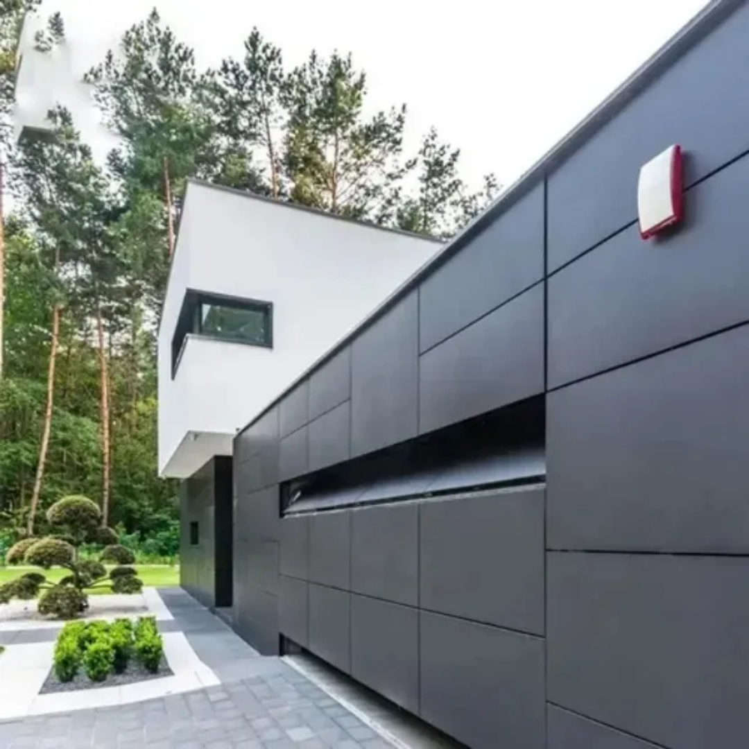
Color is one of the most powerful tools in architecture. It shapes first impressions, influences human behavior, and communicates brand values without a single word. When applied to aluminum composite panels (ACPs)—which dominate modern building facades, interiors, and signage—color choice becomes a strategic decision with measurable psychological and commercial consequences.
For procurement professionals and architects, understanding color psychology is not merely an aesthetic exercise. It is a science-backed approach to selecting ACP finishes that enhance occupant well-being, reinforce brand identity, and increase property value. This article explores how different colors affect human perception and behavior, and how to apply this knowledge when specifying ACPs for your next project.
The Science of Color Perception
Before diving into specific hues, it is essential to understand how humans perceive color. Light enters the eye, strikes the retina, and triggers neural signals to the brain’s visual cortex. But color perception is not purely physical—it is heavily influenced by context, culture, and individual experience.
However, certain psychological responses to color are nearly universal, rooted in evolutionary biology and shared human experience:
- Warm colors (reds, oranges, yellows) stimulate, energize, and attract attention. They raise perceived temperature and can increase heart rate.
- Cool colors (blues, greens, purples) calm, relax, and recede visually. They lower perceived temperature and promote focus.
Architectural ACP facades are large-scale color applications. Unlike a logo or interior accent wall, a building’s color surrounds occupants and passersby, creating a continuous psychological environment.
How Specific ACP Colors Influence Perception and Behavior
White and Light Neutrals
White is the most common ACP facade color for good reason. It symbolizes cleanliness, simplicity, and modernity. Psychologically, white creates a sense of openness, spaciousness, and neutrality.
- Effects: Calm, focus, perceived hygiene
- Best for: Medical facilities, corporate headquarters, minimalist residential, art galleries
- Considerations: Pure white can feel sterile if overused. Off-whites (RAL 9002, RAL 9010) add warmth while maintaining neutrality.
Black and Dark Grays
Black ACPs project power, sophistication, and exclusivity. They create strong contrast with surrounding elements and make adjacent colors appear more vibrant. Psychologically, black conveys authority, luxury, and mystery.
- Effects: Perceived prestige, drama, containment
- Best for: Luxury retail, automotive showrooms, high-end residential, corporate landmarks
- Considerations: Dark colors absorb heat and can feel imposing if used without relief. Balance with lighter accents or glazing.
Blue
Blue is consistently rated as the world’s most liked color. It evokes trust, stability, and intelligence. In architecture, blue facades feel calm and professional. Lighter blues (sky, powder) feel airy and approachable; darker blues (navy, cobalt) convey depth and authority.
- Effects: Trust, calm, productivity
- Best for: Financial institutions, technology companies, healthcare, schools
- Considerations: Very dark blues may appear black in low light. Test samples under expected lighting conditions.
Green
Green symbolizes nature, growth, health, and balance. It is the most restful color for the human eye, requiring no adjustment from the lens. Green facades connect buildings to their natural surroundings and promote feelings of well-being.
- Effects: Relaxation, restoration, environmental values
- Best for: Healthcare, residential, wellness centers, eco-conscious brands, educational campuses
- Considerations: Olive and sage greens feel organic; bright greens feel energetic and youthful.
Red
Red is the most emotionally intense color. It raises heart rate, attracts immediate attention, and conveys energy, passion, and urgency. In architecture, red ACPs create focal points, mark entrances, and energize public spaces.
- Effects: Excitement, urgency, attention-grabbing
- Best for: Entertainment venues, retail accents, restaurants, sports facilities, brand statements
- Considerations: Overuse of red can cause visual fatigue or anxiety. Best used as an accent rather than entire facade.
Yellow
Yellow is the most visible color in the spectrum. It evokes optimism, warmth, and creativity. Yellow ACPs attract attention and create cheerful, welcoming environments.
- Effects: Happiness, energy, visibility
- Best for: Educational facilities, childcare centers, creative offices, retail, wayfinding accents
- Considerations: Bright yellows can cause eye strain if overused. Pale yellows are more restful.
Orange
Orange combines the energy of red and the friendliness of yellow. It conveys enthusiasm, creativity, and affordability. Orange ACPs are less common than other colors, making them distinctive and memorable.
- Effects: Warmth, playfulness, approachability
- Best for: Hospitality, fitness centers, creative agencies, youth-oriented brands
- Considerations: Orange can appear cheap if not paired with quality materials. Use with restraint.
Brown and Earth Tones
Browns, terracottas, beiges, and olive greens connect buildings to the earth. They convey stability, reliability, and timelessness. Unlike vibrant colors, earth tones rarely feel dated.
- Effects: Grounded, trustworthy, organic
- Best for: Residential, hospitality, institutional, historic districts, sustainable projects
- Considerations: Dark earth tones absorb heat. Lighter earth tones are more versatile.
Color Combinations and Contrast
Individual color psychology is only part of the equation. How colors interact on a facade—through combinations, contrasts, and proportions—creates additional psychological effects.
Monochromatic Schemes: Using varying shades of a single color (e.g., light blue, medium blue, dark blue) creates harmony, calm, and sophistication. This approach is safe and elegant but risks monotony.
Complementary Contrast: Opposite colors on the color wheel (e.g., blue and orange, red and green) create high energy and visual excitement. Use for accents, not entire facades.
Analogous Schemes: Colors adjacent on the wheel (e.g., blue, blue-green, green) create natural, pleasing sequences. Ideal for large-scale facades that need visual interest without chaos.
Neutral + Accent: A neutral base (white, gray, beige) with a single vibrant accent color creates focus and hierarchy. This is the most common successful strategy for commercial facades.
Cultural and Contextual Considerations
While some color responses are universal, culture and geography modify meaning. Procurement professionals specifying ACPs for international projects must research local color symbolism.
Color | Western Meaning | Eastern Meaning |
White | Purity, weddings | Mourning, funerals (China, India) |
Red | Passion, danger | Luck, prosperity (China), celebration (India) |
Yellow | Happiness, caution | Royalty, power (China), sacred (India) |
Purple | Royalty, luxury | Mourning (Thailand), wealth (China) |
Beyond culture, consider the building’s physical context. A bright yellow ACP facade that energizes a cloudy northern city may feel jarring in a sun-drenched desert. A dark navy facade that conveys sophistication in a financial district may feel oppressive in a residential neighborhood.
Practical Application: Matching Color Psychology to Building Types
Use this guide to align ACP color selection with building function and desired occupant experience:
Building Type | Recommended Colors | Psychological Goal |
Hospital / Clinic | Whites, light blues, sage greens | Calm, cleanliness, trust |
School / University | Light yellows, greens, blues, earth tones | Focus, optimism, growth |
Corporate Headquarters | Navy, charcoal, white, silver, forest green | Professionalism, stability, intelligence |
Retail (Luxury) | Black, white, deep red, metallic | Exclusivity, desire, sophistication |
Retail (Mass Market) | Bright blues, oranges, yellows | Energy, approachability, visibility |
Residential (High-End) | Warm grays, beiges, olive, charcoal | Comfort, permanence, understated luxury |
Residential (Affordable) | Soft blues, warm yellows, light greens | Welcoming, optimistic, safe |
Hospitality / Hotel | Warm earth tones, deep blues, burgundy | Relaxation, luxury, escape |
Restaurant (Fast Food) | Red, yellow, orange | Energy, hunger stimulation, speed |
Restaurant (Fine Dining) | Deep reds, warm browns, charcoal | Intimacy, richness, appetite |
Fitness Center | Orange, bright blue, lime green | Energy, motivation, vitality |
The Role of Gloss and Finish
Color psychology is mediated by surface finish. The same color in gloss versus matte produces different psychological responses:
- High-Gloss: Feels modern, expensive, high-energy. Reflects surroundings, creating dynamic, changing impressions. Best for accent elements and premium applications.
-Matte: Feels calm, understated, permanent. Absorbs light, creating consistent, quiet presence. Best for large-scale facades and residential contexts.
- Metallic: Feels futuristic, premium, dynamic. Sparkle adds excitement without the glare of high-gloss. Best for signature buildings and corporate landmarks.
Procurement Considerations for Color Psychology
When specifying ACP colors based on psychological principles, professional buyers should:
1. Request Full-Size Samples – Color perception changes with scale. A small swatch that looks calm may feel overwhelming on a 10-story facade.
2. Evaluate Under Multiple Lighting Conditions – View samples in direct sun, overcast sky, morning, evening, and artificial light. Color psychology shifts with illumination.
3. Consider Long-Term Trends – Vibrant, trendy colors may feel dated within five years. Earth tones, neutrals, and classic blues maintain psychological effectiveness longer.
4. Verify Fade Resistance – Psychological impact depends on consistent color. Specify PVDF coatings with documented UV stability (low ΔE) to prevent color drift.
5. Integrate with Brand Guidelines – For corporate projects, ensure ACP colors align with existing brand color psychology. A mismatch creates cognitive dissonance.
6. Test with Mock-Ups – For large or sensitive projects, build a full-scale mock-up and gather feedback from potential occupants or users. Real-world reactions are invaluable.
Conclusion
The psychology of color in architectural aluminum composite panels is a powerful, often underutilized tool. Color choices affect how people feel, behave, and perceive value. A hospital clad in calming blues and whites reduces patient anxiety. A school in optimistic yellows and greens supports learning. A luxury retailer in deep black and metallic silver signals exclusivity and commands premium pricing.
For procurement professionals, understanding color psychology transforms ACP selection from a purely aesthetic decision into a strategic investment in occupant well-being, brand identity, and property performance. By matching color to building function, context, and cultural setting, you create facades that do more than enclose space—they shape human experience.