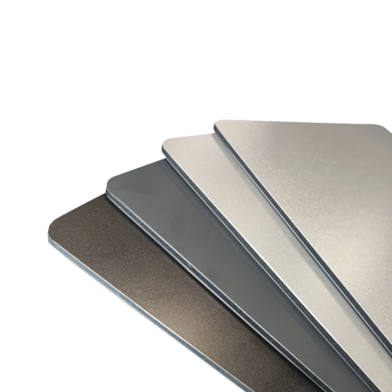
Welcome to Vbond
What Your Architect Wishes You Knew About Selecting ACP Colors
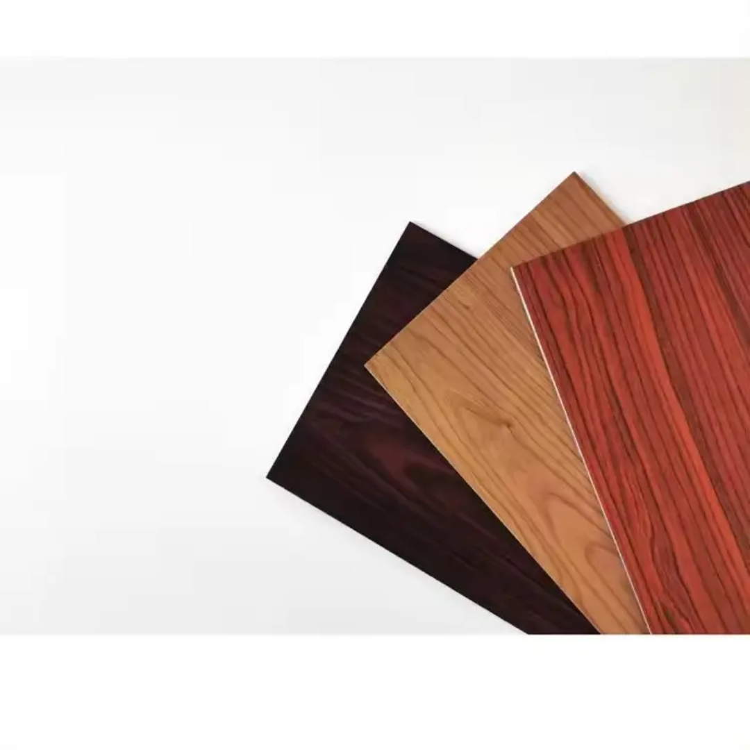
Choosing ACP colors isn't just about picking your favorite shade. Discover the technical, psychological, and practical factors architects consider—from heat reflection and fading to brand identity and maintenance—before finalizing your facade palette.
You're standing in front of a display rack, flipping through hundreds of ACP (Aluminum Composite Panel) color swatches. The glossy red catches your eye. The matte black looks sophisticated. But your architect keeps asking questions that seem unrelated to color: "What's the building's orientation?" "Do you have a maintenance crew?" "How many hours of direct sun does the west facade get?"
If this sounds familiar, you're not alone. Most building owners and developers approach ACP color selection as a purely aesthetic decision. But for architects, color is a technical specification that impacts everything from energy bills to structural integrity.
This article reveals what your architect wishes they could tell you about selecting ACP colors—the factors that separate a facade that performs from one that simply looks good on paper.
Beyond Aesthetics: The Hidden Science of ACP Color Selection
Thermal Performance: Dark Colors Absorb Heat
One of the first things architects consider when selecting ACP colors is thermodynamics. The color of your facade directly affects how much heat the building absorbs.
The Physics of Color:
- Dark colors absorb more solar radiation (up to 90% of incoming energy)
- Light colors reflect more sunlight, keeping the building cooler
For a warehouse or commercial building in a hot climate, choosing dark-colored ACP can increase cooling loads by 15-25% . The panels themselves also expand more with heat absorption, potentially affecting joint performance over time.
What Your Architect Wishes You Knew:
"If you insist on dark colors for a south-facing facade in a hot region, we need to discuss ventilation strategies and expansion joint design. It's not just about aesthetics—it's about whether the building can shed that heat without warping or overworking the HVAC system."
Color Stability: Will It Fade?
That deep crimson you love today might look like faded brick in five years. ACP color selection must account for long-term UV exposure.
Factors Affecting Color Stability:
Factor | Impact on Color |
Coating Type | PVDF (polyvinylidene fluoride) coatings offer superior UV resistance vs. polyester |
Color Chemistry | Reds and blues fade faster than earth tones and metallics |
Gloss Level | High-gloss shows fading and wear more visibly than matte |
Location | Coastal or high-UV environments accelerate fading |
The Architect's Insight:
"We specify PVDF coatings for exterior ACP because they maintain color integrity for 20+ years. Polyester might save money upfront, but the color shift will be noticeable within 3-5 years. For your corporate headquarters, that's a reputation risk."
Psychological Impact: Colors Communicate Before Words Do
Your building speaks to everyone who sees it. The ACP color palette sets that tone before anyone reads your signage.
Color Psychology in Commercial Architecture
Blue communicates trust, stability, and professionalism. It's why financial institutions and healthcare facilities often choose blue-toned facades.
Green suggests sustainability, growth, and harmony. Perfect for environmental organizations or wellness-focused businesses.
Red demands attention and conveys energy, passion, and urgency. Retailers and entertainment venues leverage red for visibility.
Gray/Silver represents modernity, efficiency, and neutrality. Tech companies and industrial facilities favor metallics for their contemporary appeal.
Black signals luxury, sophistication, and authority. High-end brands use black ACP for dramatic impact.
White communicates cleanliness, simplicity, and precision. Medical facilities and minimalist architecture embrace white facades.
What Your Architect Wishes You Knew:
"Your color choice tells a story about your brand. If you're a healthcare provider wanting to convey calm and cleanliness, that vibrant orange you love might actually make patients feel anxious. Let's align the palette with your brand psychology, not just personal preference."
Practical Realities: Maintenance and Longevity
Dirt and Stain Visibility
Light-colored ACP shows dirt accumulation more quickly—especially in industrial areas or near roadways. Dark colors hide dirt better but show water spotting and streaks.
Climate Considerations:
- Arid regions: Dust shows more on dark colors
- Humid regions: Algae growth shows on light colors
- Coastal areas: Salt spray affects all colors but shows more on dark finishes
Graffiti Resistance
For urban buildings, graffiti risk is real. Glossy, light-colored ACP surfaces are easier to clean than textured or matte finishes. Some manufacturers offer anti-graffiti coatings that allow solvent cleaning without damaging the underlying color.
Repair and Matching
Years from now, will you be able to match that custom ACP color if a panel gets damaged? Standard RAL colors are easier to match than custom blends. Architects know that selecting ACP colors from standard manufacturer ranges ensures future repairability.
The Architect's Honest Advice:
"That custom peach color you love? If we need replacement panels in 10 years, we'll never match it perfectly. Stick to manufacturer standard colors for anything below 20 feet where color variation would be noticeable."
Environmental and Regulatory Factors
Local Climate and Microclimate
Architects analyze sun paths, prevailing winds, and surrounding reflectivity when selecting ACP colors:
- Reflective glare: Highly polished ACP in direct sun can blind drivers or overheat neighboring buildings
- Heat island effect: Dark colors in urban areas contribute to ambient temperature rise
- Wind-driven rain: Certain colors show streaking patterns more prominently
Building Codes and Restrictions
Many municipalities restrict facade colors, particularly in:
- Historic districts
- Planned communities with HOAs
- Areas near airports (certain colors attract birds or affect visibility)
- Zones with specific design guidelines
What Architects Wish You'd Ask:
"Before we fall in love with a color, let's check local ordinances. I've seen beautiful projects derailed because the city rejected the palette after permits were filed."
Brand Integration: Making Your Building Work for Your Business
Corporate Identity on a Grand Scale
Your building is your largest business card. ACP color selection should extend your brand identity to architectural scale.
Strategic Questions:
- Does the color match your logo exactly, or should it complement it?
- How does the facade color interact with illuminated signage?
- Will the building appear consistent in photographs for marketing materials?
Zoning and Color Blocking
Sophisticated ACP facade design often uses multiple colors strategically:
- Base colors ground the building visually
- Accent colors highlight entrances or architectural features
- Neutral transitions connect different building volumes
The Architect's Perspective:
"Think of your facade as a uniform for your business. It should be recognizable, professional, and appropriate for your industry. A law firm probably shouldn't look like a nightclub, and a daycare shouldn't resemble a bank."
Technical Specifications Behind the Swatch
Coating Types Explained
Architects consider coating chemistry as carefully as color:
- PVDF (70% or 50%): The gold standard for exterior ACP. Withstands UV, acid rain, and industrial pollutants. Maintains color for decades .
- Polyester: Economical but less durable. Suitable for interior or temporary applications.
- FEVE: High-performance fluoropolymer with excellent gloss retention.
- Nano-coatings: Self-cleaning and anti-pollution technologies for premium projects.
Gloss Levels
- High gloss (60-80%): Dramatic appearance but shows scratches and requires careful maintenance
- Medium gloss (30-50%): Balances appearance with practicality
- Matte/low gloss (10-20%): Hides imperfections, modern aesthetic, harder to clean
What Architects Know That Owners Don't:
"High-gloss black looks incredible in renderings. In reality, it shows every fingerprint during installation, every water spot after rain, and every micro-scratch from cleaning. If you want low-maintenance, choose matte or textured finishes."
The Selection Process: How Architects Approach Color
Step 1: Context Analysis
Before opening a color deck, architects study:
- Surrounding buildings and landscape
- Natural light patterns throughout the day
- Viewing distances and angles
- Adjacent materials (concrete, glass, roofing)
Step 2: Mock-Ups and Samples
Colors look different in the showroom than on a building. Architects insist on:
- Large format samples (minimum 2' x 2') viewed in actual light conditions
- On-site mock-ups for critical facades
- Viewing at multiple times of day
Step 3: Material Combinations
ACP rarely stands alone. Architects consider how colors interact with:
- Window frames and glazing
- Entry doors and storefronts
- Roofing and coping
- Landscaping and hardscaping
Step 4: Future-Proofing
Smart ACP color selection anticipates:
- Future building additions
- Changing neighborhood character
- Long-term maintenance capabilities
Common ACP Color Selection Mistakes Owners Make
1. Choosing From Small Samples
That 2" x 3" swatch represents the color, not the experience. A color that looks subtle in your hand can overwhelm a 40-foot wall.
2. Ignoring Orientation
South-facing facades need different color considerations than north-facing ones. Direct sun intensifies colors; north light softens them.
3. Forgetting Night Appearance
How does the color look under parking lot lights or streetlights? Some colors shift dramatically under artificial illumination.
4. Matching Paint Chips Exactly
ACP colors read differently than paint on drywall. The metallic substrate affects color perception. Always use ACP-specific references.
5. Following Trends Blindly
That trendy millennial pink or bold chartreuse might look dated in five years. Classic colors have longer architectural relevance.
The Architect's Honest Color Recommendations
For Maximum Longevity
- RAL 7000-9000 series: Grey tones that age gracefully
- Metallic silvers: Hide imperfections, match everything
- Earth tones: Connect to natural surroundings
- Off-whites: Classic, bright, but choose warm or cool based on light
For Brand Impact
- Use brand colors as accents on 20-30% of the facade
- Reserve neutrals for primary surfaces
- Consider illuminated branding integration
For Hot Climates
- Light colors with solar reflectance >0.7
- PVDF coatings to prevent chalkiness
- Matte finishes to reduce glare
For Cold Climates
- Dark colors can passively absorb heat
- Ensure coatings handle freeze-thaw cycles
- Consider snow reflection when selecting
Working With Your Architect: Questions to Ask
To get the best results from your ACP color selection process, ask your architect:
1. "What colors will minimize our long-term maintenance costs?"
2. "How do these options compare for energy efficiency?"
3. "Can we see large mock-ups in different lighting conditions?"
4. "What's the replacement availability for these colors in 10 years?"
5. "How will these colors interact with our signage and branding?"
6. "Are there any local restrictions we should consider?"
7. "What do similar buildings in our area use successfully?"
Conclusion: The Partnership Approach to Color Selection
Selecting ACP colors isn't a solo decision or a purely architectural one—it's a partnership. Your architect brings technical knowledge, aesthetic training, and practical experience. You bring brand understanding, business goals, and personal investment in the project.
When these perspectives combine, the result is a facade that:
- Performs thermally and structurally
- Endures visually and physically
- Communicates your brand effectively
- Integrates with its environment
- Delights everyone who sees it
The next time you're tempted to choose a color based solely on a swatch, remember what your architect wishes you knew: color is chemistry, physics, psychology, and poetry all at once. And getting it right means considering all of them together.
Frequently Asked Questions
How do I ensure my chosen ACP color won't fade?
Specify PVDF coatings (70% resin content) from reputable manufacturers. These provide the best UV resistance and color stability for exterior applications .
Can I match my exact brand color in ACP?
Most manufacturers offer custom color matching, but be aware that custom colors cost more, take longer, and may be difficult to match for future replacements .
What's the most practical color for a warehouse?
Medium to light grays offer the best balance of heat reflection, dirt hiding, and timeless appearance. They also coordinate easily with signage and other building elements .
How do glossy and matte finishes compare?
High-gloss offers dramatic appearance but shows imperfections and requires careful maintenance. Matte finishes hide issues and offer modern aesthetics but can be harder to clean .
Should I use multiple colors on my building?
Thoughtful color blocking adds architectural interest and can highlight building features. Work with your architect to develop a cohesive palette rather than random color placement .
How important is the sample viewing process?
Critical. Colors appear differently in showroom lighting versus natural light. Always view large samples on-site at different times of day before finalizing .